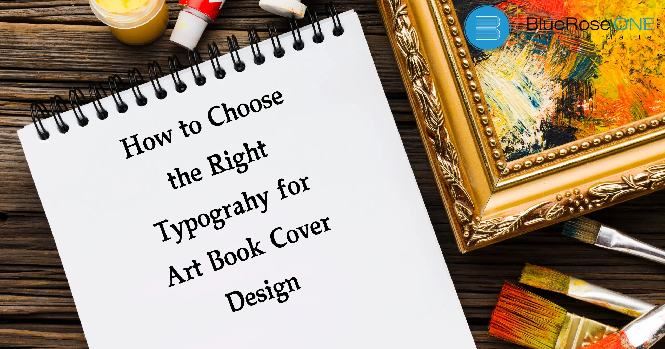
The cover of an art book makes the initial and frequently most important impression. It’s the visual ambassador, tempting potential readers to explore the world within. The technique of arranging type, known as typography, is essential to this process. The proper typeface may boost your book cover by conveying the soul of the work within, whilst the wrong one might be a turnoff. In this detailed article, we will look at the complexities of typography choices for art book cover design, allowing you to make informed judgements that resonate with your target audience.
Understand the Role of Typography in Art Book Covers
Typography is more than just words on a page; it’s a visual language capable of evoking emotions, conveying messages, and setting the tone. In the context of an art book, typography should complement the artwork, reinforcing or contrasting its mood and style.
Reflecting the Art
Reflecting the art in art book cover design is selecting typography that matches and enhances the artwork. The proper font should complement the visual aspects, reflecting the book’s theme and tone.
For example, a classic serif font might represent sophistication in historical art, yet a bold sans-serif typeface may suit current, abstract works. Ensure that the font is both visually beautiful and readable, resulting in a coherent design that draws readers in and represents the soul of the art within.
Creating Hierarchy
Creating a hierarchy in art book cover design is critical for directing visitors’ attention and conveying the book’s core. Use multiple font sizes and weights to distinguish crucial parts such as the title, author’s name, and subtitles.
The headline should be the most prominent, drawing attention initially, with subsequent information smaller but still accessible. This visual hierarchy allows readers to rapidly grasp the book’s major point and improves the overall aesthetic, making your cover both appealing and effective.
Eliciting Emotions
Typography plays a crucial role in art book cover design by evoking emotions and setting the tone for the reader. The choice of font style, size, and color can convey feelings ranging from elegance and sophistication to playfulness and intrigue.
For instance, a bold, modern typeface can create a sense of excitement, while a delicate script might evoke nostalgia. By thoughtfully selecting typography, designers can effectively communicate the book’s mood and attract the right audience.
Building Brand Identity
Building brand identity through typography is critical in art book cover design. The proper typeface can reflect the book’s tone and match the author’s vision, making the cover instantly recognisable.
Fonts help to create a visual connection with the audience and might elicit specific emotions or ideas relating to the material.
Consistent font throughout marketing materials strengthens the brand and develops a cohesive identity that distinguishes it in the competitive art book industry.
You may also like: The 10+ Best John Steinback Books Everyone Should Read
Key Factors to Consider When Choosing Typography
Genre and Style of Art
Abstract Art
When creating an art book cover, it is critical to use typography that matches the genre and style of the artwork. Typography should support abstract art’s distinct and nonrepresentational shapes. Choose clean, modern, and minimalist fonts to prevent overshadowing the art’s visual complexity.
The proper typeface compliments the abstract aspect of the artwork, making the cover both appealing and unified. This alignment of style and typography contributes to a cohesive art book cover design that attracts potential readers.
Figurative Art
When designing an art book cover, the typography should match the genre and style of the artwork inside. Figurative art, which depicts real-life characters and scenes, requires typography that complements its realistic and frequently detailed nature.
Choose clean, classic fonts that won’t overshadow the artwork. For example, a serif font can improve the classic sense of figurative painting, resulting in a unified and professional cover design that complements the book’s content.
Photography
When choosing typography for an art book cover design, think about how it matches the genre and style of the artwork. For example, a modern, minimalist cover may benefit from sleek, sans-serif typefaces, yet a classic or historical art book may utilize exquisite, serif fonts to complement the traditional vibe.
The font should improve the visual appeal and reflect the tone of the artwork, ensuring that the design speaks to the intended audience and appropriately portrays the book’s content.
Illustration
When selecting typography for an art book cover design, think about the genre and style of the work within. For abstract or modern art, choose sleek, minimalist typefaces that enhance the visual simplicity.
Elegant serif typefaces can give classical or complicated artwork a more traditional air. The font should reflect the art’s style, giving a consistent design that attracts the correct audience and sets the tone for the book’s content.
You may also read: Top 5 Ways to Use Chapterly for Books
2. Target Audience
Consider the demographics of your target audience.
When selecting typeface for your art book cover design, you must consider your target audience’s demographics. Understanding their age, interests, and preferences will help you choose fonts that appeal to them.
For example, a modern, sleek typeface may appeal to a younger, trendier audience, whereas a classic serif may appeal to a more conventional demographic.
Tailoring your font to these demographics ensures that your cover design effectively engages and attracts your target audience.
Analyze the reading habits and preferences of your target audience.
When selecting fonts for an art book cover design, consider your target audience’s reading habits and preferences. Understanding your readers’ preferences helps you choose typefaces that appeal to them.
For example, if your target audience favors modern and minimalist designs, clean, sans-serif fonts may be more appealing. If they prefer classic aesthetics, elegant serif fonts may be more successful.
Tailoring your font to these preferences guarantees that your art book cover design attracts and engages the appropriate readers.
3. Readability
Prioritize legibility
When developing an art book cover, intelligibility is essential. Choose fonts that are legible at different sizes and from a distance. Avoid extremely decorative or complex fonts that appear trendy but are difficult to read.
Clear, straightforward font makes the title and author’s name immediately recognisable, allowing your art book to stand out on the shelf and attract potential readers. Remember that readability improves both the aesthetics and utility of your cover design.
Consider the font weight and spacing
Font weight and spacing are important considerations when selecting typography for an art book cover design. Font weight influences visual impact; bolder typefaces stand out more, but can become overwhelming if used excessively. Spacing, including letter and line spacing, promotes readability and visual balance.
Proper spacing keeps the text from appearing crowded, making it easier to read. Balancing these components improves the cover’s appeal and clarity, leading to a more engaging design.
Test the typography on different backgrounds and sizes
When developing an art book cover, it is critical to test the font against various backdrops and sizes. This guarantees that the text remains clear and readable under various viewing conditions.
For example, typefaces that look wonderful on a light background may not be as effective on a dark one. Similarly, fonts that are legible in high sizes may become difficult to read when scaled down.
By reviewing typography under these settings, you can ensure that your art book cover design is visually appealing and easy to read.
You may also like: The Best 10 Writing Conferences for Aspiring Authors in 2024
4. Visual Hierarchy
Create a clear hierarchy of information
To create a clear hierarchy of information in art book cover design, start by prioritizing the most important elements. Place the book title in the largest, most prominent font to catch attention first.
The author’s name should be smaller but still noticeable. Additional details, such as a subtitle or tagline, should be even smaller and placed lower or in less dominant areas. This hierarchy guides the viewer’s eye and ensures that key information stands out effectively.
Use font size, weight, and spacing to differentiate elements
To create a clear visual hierarchy, art book cover designers must use font size, weight, and spacing. Larger typefaces tend to draw more attention and highlight key information, such as the book title.
Bold or heavy weights can highlight important features, such as the author’s name, whilst lighter typefaces are employed for minor details.
Adjusting the spacing between lines and characters can improve readability and balance in the overall design. By carefully manipulating these typographic features, you can ensure that your cover properly directs the viewer’s attention and communicates the substance of the book.
5. Consistency and Harmony
Maintain consistency throughout the book cover
Maintaining uniformity throughout the art book cover design is essential for achieving a coherent and professional appearance. Ensure that the typeface, colors, and pictures are consistent with the book’s theme and style.
Consistent font and color schemes serve to strengthen the book’s identity and make it easily identifiable. Avoid using too many various styles or typefaces, as this might cause visual clutter and detract from the cover’s core message. A cohesive design increases the book’s attractiveness and successfully communicates its content to potential readers.
Ensure harmony between the typography and other design elements
To establish harmony between typography and other design components in art book cover design, a consistent style must be used throughout. Choose fonts that compliment the artwork and general theme while avoiding clashes or incompatible styles.
The typography should coordinate with visual aspects like colors, images, and layout to create a cohesive design. Consistent spacing and font choice contribute to a balanced design, making the cover visually beautiful while also effectively conveying the core of the book.
Typography Styles and Their Impact
- Serif Fonts: Characterized by small strokes at the end of letterforms, serif fonts often convey tradition, elegance, and formality. They are suitable for art books with a classic or historical focus.
- Sans-Serif Fonts: Lacking serif features, sans-serif fonts are typically modern, clean, and minimalist. They are versatile and can be used for various art book genres.
- Script Fonts: Cursive and flowing, script fonts add a touch of elegance and femininity. They are well-suited for art books featuring fashion, beauty, or romantic themes.
- Display Fonts: Bold and attention-grabbing, display fonts are ideal for headlines and titles. They can be used to create impact and convey a strong message.
Tips for Typography Experimentation
- Explore different font combinations: Try pairing different font styles to create interesting contrasts.
- Play with font sizes and weights: Experiment with different sizes and weights to find the perfect balance.
- Consider kerning and tracking: Fine-tune the spacing between letters and words for optimal readability.
- Use typography as a design element: Incorporate typography into the overall design, creating patterns or shapes.
- Seek feedback: Get opinions from others to gain fresh perspectives.
Conclusion
Choosing the right typography for an art book cover is a crucial decision that can significantly impact its success. By carefully considering the factors outlined in this guide and experimenting with different options, you can create a cover that not only captures the essence of the art but also entices potential readers to explore the pages within. Remember, typography is a powerful tool that, when used effectively, can elevate your art book to new heights.