
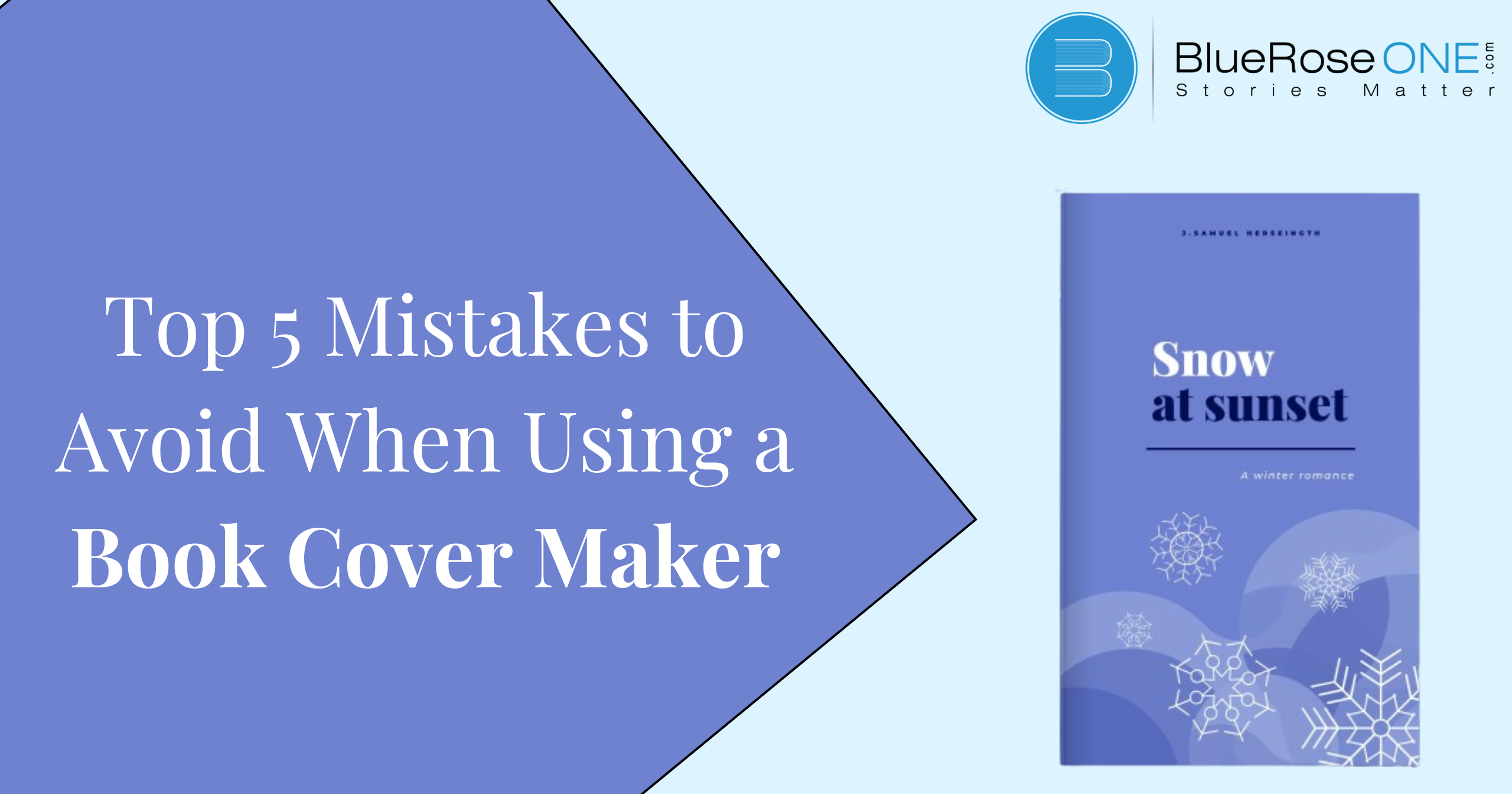
When it comes to attracting readers’ attention and summarizing a book, book covers are quite important which can be designed with book cover maker.
With the rise of self-publishing in the digital age, using book cover makers has grown in popularity. Though convenient, there are several typical faults in book covers that authors should avoid to make sure their work is properly represented and draws in readers.
Choosing the Wrong Template
Choosing the incorrect template is one of the most frequent errors made while utilizing a book cover maker. The entire look and feel of the cover design is influenced by the templates that form its base. Selecting a template that is at odds with the book’s category or tone will confuse prospective buyers and lessen the book’s appeal.
Authors should carefully assess the available templates and take into account elements like genre, target audience, and visual style in order to avoid making this error. It’s important to consider customisation possibilities to make sure the selected template may be adjusted to meet the book’s unique needs.
You may also like: 10 Effective Strategies to improve your reading habits
Ignoring Branding Guidelines
Another common error made by authors is to create their book covers without taking branding requirements into consideration. Maintaining consistency in branding cultivates a recognisable identity and encourages reader loyalty and trust. Branding principles should be followed to avoid a disconnected brand image and to protect the author’s credibility.
It is imperative for authors to guarantee that the color schemes, fonts, and artwork used on their book covers are consistent with their overall brand identity. By ensuring uniformity in all promotional materials, writers may bolster their brand awareness and leave a lasting impact on readers.
Overcrowding the Design
In book cover design, packing the layout with too many elements is a common mistake. Although it could be tempting to pack as much information as you can into a design, cluttered designs can overwhelm readers and take attention away from the book’s main point.
When designing their covers, authors should aim for clarity and simplicity, concentrating on the essential components that best express the spirit of the work. When it comes to drawing in readers and conveying the genre or concept of the book, minimalist designs frequently work better.
Ignoring Typography
Despite the fact that typography is vital to a book cover’s impact, writers frequently ignore it. Bad font selections can take away from the overall aesthetic and make the cover hard to read, which can lead to missed opportunities to draw in readers.
When creating book covers, authors should give great thought to typography, choosing typefaces that both fit the topic and improve readability. Finding the ideal ratio of intelligibility to aesthetics can be achieved by experimenting with various font sizes, styles, and layouts.
You may also like: The Rise of Audiobooks: A Game-changer for Modern Bookworms
Forgetting About Target Audience
When creating book covers, authors often make the crucial error of not considering their intended readership. To create covers that appeal with readers and encourage them to investigate deeper, it is imperative to have a thorough understanding of the preferences and expectations of the target population.
To find out the preferences, interests, and demographics of their target audience, authors should perform research. Writers can enhance the possibility of drawing in readers and sparking interest in their works by customizing their book covers to appeal to their target audience.
Conclusion
To sum up, for writers who want to design polished book covers, utilizing a book cover maker might be an easy and affordable option. But in order to get the most out of these tools, writers need to steer clear of frequent blunders like selecting the incorrect template, disobeying branding standards, packing the design with too many elements, ignoring typography, and losing sight of their intended audience.
In the cutthroat world of publishing, authors can increase the visibility and appeal of their works by avoiding these mistakes and adhering to best practices in cover design.