Writing a book is an enormous achievement, but presenting it in a polished and reader-friendly style is as important. Whether you self-publish or submit your book to established publishers, appropriate formatting improves the overall reading experience. In this comprehensive guide, we’ll go over the essential steps for effectively formatting your book, including file types, novel formatting guidelines, selecting the right formatting programme, creating front and back matter, ebook and print book formatting rules, trim size selection, designing beautiful chapter pages, book formatting services, and key formatting terms.
Understanding File Types of Book Formatting
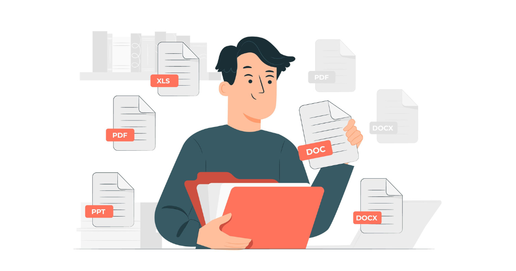
Before delving into the formatting process, it’s crucial to understand the different file types associated with book formatting. Common file types include:
- Word Document (.doc or.docx): Widely used for drafting and editing manuscripts.
- PDF (Portable Document Format): Ideal for preserving formatting across various devices and platforms.
- EPUB (Electronic Publication): Specifically designed for ebooks, allowing dynamic text adjustment.
- MOBI (Mobipocket): A format compatible with Kindle devices and apps.
Each file type serves a specific purpose in the publishing journey, and understanding their nuances is fundamental for effective book formatting.
You may also like: Is Kindle Direct Publishing right for Your Next Book?
Novel Formatting Guidelines
Step 1: Decide Which Formatting Programme to Use
Choosing the right formatting programme is a critical decision in the book formatting process. The programme you select will influence the overall look and feel of your book, impacting factors such as layout, font choices, and general aesthetics. Here are some popular options and considerations:
- Microsoft Word:
- Strengths: user-friendly, widely accessible, and familiar to many writers.
- Considerations: Limited control over intricate layouts, especially for complex designs.
- Google Docs:
- Strengths: collaborative features, cloud-based accessibility, and basic formatting tools.
- Considerations: Limited advanced formatting options compared to dedicated design software.
- Scrivener:
- Strengths: Tailored for writers, allowing easy organisation and navigation of large manuscripts.
- Considerations: It may have a steeper learning curve for those unfamiliar with the software.
- Adobe InDesign:
- Strengths: professional-grade layout capabilities; extensive design features.
- Considerations: requires a learning curve; may be more suitable for complex layouts.
Consider your familiarity with each programme, the complexity of your book’s design needs, and your budget. For instance, an author with a straightforward manuscript might find Microsoft Word sufficient, while a graphic-heavy or intricate design might benefit from Adobe InDesign.
Assume you’re creating a nonfiction book with basic formatting requirements, such as headers, subheadings, and occasional graphics. In this scenario, Microsoft Word, with its user-friendly design and ubiquitous availability, may be the most practical option. It helps you to concentrate on your content without being distracted by complex design aspects.
Step 2: Creating Your Front and Back Matter
Front and back matter are crucial components that frame your book, providing essential information and enhancing the reader’s experience. Understanding how to structure these sections contributes to the overall professionalism of your work.
- Front Matter:
- Title Page: Includes the book title, author’s name, and possibly a subtitle or series information.
- Table of Contents: Lists chapters or sections with page numbers.
- Copyright Page: Contains copyright details, publication information, and legal notices.
- Dedication: Optional, for expressing gratitude or dedicating the book to someone
- Back Matter:
- Acknowledgments: Express gratitude to individuals or entities who contributed to the book.
- Author bios: brief biographies of the authors, providing context or credentials.
- Additional Titles: Promote other works by the author, encouraging continued readership.
Step 3: Rules and Guidelines for Proper Ebook Formatting
Ebook formatting is a critical aspect of the modern publishing landscape, considering the increasing prevalence of digital reading devices. Authors must adhere to specific rules to ensure their ebooks are visually appealing and function seamlessly across various e-reader devices.
Embedding Fonts: One crucial rule in ebook formatting is the embedding of fonts. Unlike print books, where fonts are fixed, ebooks should embed fonts to maintain consistency across different devices. Embedding ensures that the chosen font is preserved, preventing potential distortions or substitutions on readers’ devices. For example, if an author selects a unique font for chapter headings, embedding that font ensures readers see the intended visual presentation on their e-readers.
Using Consistent Styling: Consistency in styling is paramount for a professional and polished ebook. Authors must adhere to a consistent format for headings, paragraphs, and other text elements. This ensures a cohesive reading experience and prevents distracting variations that may arise from device-specific rendering. For instance, using the same font size and style for chapter headings throughout the ebook maintains a visually harmonious layout.
Optimising Images for Digital Viewing: Images play a significant role in enhancing the visual appeal of an ebook. Authors need to optimise images for digital viewing to prevent issues such as slow loading times or distorted visuals. Optimisation involves compressing images without compromising quality, ensuring a smooth reading experience. For example, an author including illustrations in a children’s ebook must ensure the images are appropriately sized and formatted for optimal viewing on diverse devices.
Understanding these intricacies of ebook formatting is crucial for authors seeking to reach a broad digital audience while maintaining the visual integrity of their work.
Step 4: Rules and Guidelines for Proper Print Book Formatting
Print book formatting involves a distinct set of rules tailored to the physical medium. Proper formatting is essential for producing print copies that meet industry standards, providing readers with a visually pleasing and comfortable reading experience.
Considerations for Margins: Margins play a significant role in print book formatting, influencing the overall aesthetics and readability. Authors must adhere to specific margin guidelines, accounting for factors like gutter space (inner margins) and outer margins. Well-defined margins contribute to a visually balanced layout, preventing text from appearing cramped or too close to the page edges.
Gutters and Bleed: Gutters, the inner margins where the pages are bound, and bleed, the extended elements beyond the trim edge, are crucial considerations for print formatting. Adequate gutter space ensures text isn’t lost in the binding process, while bleed allows for full-bleed images or elements extending to the page edges. An example could be a photography book where images seamlessly extend to the edges of the pages.
These rules and guidelines for print book formatting are essential for authors aiming to produce physical copies that align with industry standards and offer readers a satisfying tactile experience.
Step 5: Picking the Best Trim Sizes for Your Book
Selecting the right trim size is a pivotal decision in print book formatting, influencing both aesthetics and practicality. Authors should consider various factors when making this choice to ensure their book aligns with genre expectations, appeals to the target audience, and meets cost considerations.
Genre Considerations: Different genres often have preferred trim sizes that align with reader expectations. For example, a standard novel might commonly use a 6″ x 9″ trim size, while a pocket-sized mass-market paperback may opt for a smaller dimension.
Target Audience: Understanding the preferences of the target audience is crucial. For instance, a visually intricate coffee table book may benefit from a larger trim size to showcase detailed images, while a compact size might be more suitable for a travel book designed for on-the-go reading.
Printing Costs: The chosen trim size can impact printing costs, especially for colour illustrations or high-quality paper. Authors should weigh the aesthetic benefits against the budget considerations associated with printing larger or specialty sizes.
Authors need a comprehensive understanding of these considerations to make informed decisions about trim sizes, ensuring their print books align with industry standards, reader expectations, and the practicalities of production.
You may also like: Fantasy Books complete publishing guide in India 2024
How to Design Beautiful Chapter Pages
Designing captivating chapter pages adds an artistic dimension to your book, elevating the overall reading experience for your audience. Chapter pages serve as a visual transition between different sections of your narrative, and paying attention to their design can leave a lasting impression. Here are key considerations for designing beautiful chapter pages:
- Font Selection: Choosing the right font is crucial for chapter pages. The font should align with the overall theme of your book and contribute to its readability. For example, if your book has a historical setting, a classic serif font might be appropriate. If it’s a modern thriller, a clean, sans-serif font could be more fitting.
- Consistent Styling Elements: Maintain consistency in styling elements across chapter pages. This includes text alignment, spacing, and the use of any graphical elements. Consistency fosters a sense of cohesion and professionalism. For instance, if you use a particular ornamental divider between the chapter title and the text, replicate this element throughout the book.
- Decorative Elements: Consider incorporating subtle decorative elements to enhance visual appeal. This could be a small graphic, an artistic divider, or an accent colour that complements your book’s cover design. These elements shouldn’t overshadow the text but should add a touch of uniqueness to each chapter.
- Whitespace Management: Proper management of whitespace is essential for a clean and polished look. Avoid cluttering the chapter page with too many elements. Whitespace helps guide the reader’s focus and prevents visual overload. An example of effective whitespace usage is having sufficient margin space around the chapter title.
- Example: Imagine a fantasy novel where each chapter begins with an elaborate drop cap representing a mythical creature relevant to the story. The font used for chapter titles mimics ancient calligraphy, creating an immersive experience for readers. Consistent use of a decorative border at the bottom of each page adds to the book’s visual allure.
List of Book Formatting Services
For authors seeking professional assistance in ensuring their book meets industry standards, a list of reputable book formatting services is provided. These services offer expertise in both ebook and print book formatting, catering to authors with diverse needs and preferences. Here are some aspects to consider:
- Ebook Formatting: Services specialising in ebook formatting understand the unique requirements for digital reading. They ensure proper flow, text adaptability across devices, and compatibility with various ebook platforms.
- Print Book Formatting: For authors planning physical copies, print book formatting services focus on aspects like trim size, margins, and bleed. They ensure your book meets printing standards and provides a pleasant reading experience in its physical form.
- Customisation Options: Reputable formatting services often offer customisation options to align with your book’s genre and style. Whether it’s a specific font choice, layout preference, or decorative elements, these services can tailor formatting to your vision.
Glossary: Key Book Formatting Terms to Know
Empowering authors with a glossary of key terms related to book formatting facilitates effective communication with editors, designers, and formatting professionals. Here are some terms explained:
- Bleed: Bleed refers to the area outside the trimmed edges of a printed page. Elements intended to extend to the page’s edge should extend into this bleed area.
- Drop Cap: A large, decorative capital letter at the beginning of a chapter or paragraph, often used for stylistic emphasis.
- Front Matter: The preliminary pages of a book, including the title page, copyright page, and table of contents.
- Back Matter: The concluding pages of a book, encompassing elements like an author’s bio, acknowledgments, and additional titles.
- Example: An author discussing formatting preferences with a designer might say, “I envision a drop cap at the start of each chapter and want a clean design with ample whitespace. Let’s ensure the bleed accommodates any full-page graphics in the print version.”
In conclusion, mastering the art of book formatting is essential for authors committed to presenting their work in the best possible light. This comprehensive guide serves as a roadmap, covering every aspect from file types to the finer details of designing beautiful chapter pages. Whether you’re a self-published author or navigating the traditional publishing route, investing time and effort into proper book formatting is a crucial step towards ensuring your literary creation is well-received by readers.
Publish your book with BlueRoseONE and become a bestselling author. Don’t let your dream of becoming an author fade away, grab the opportunity now and publish your book – be it fiction, non fiction, poetry or more.
You may also like: List of 15 Prestigious Literary Awards in 2024